As I had planned, I did some experiments with cyanotypes. I really love this process now (at least while it’s summer and the sun is out to expose the images).
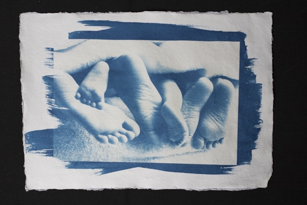
My first problem had been that I wanted to use the rougher paper but that a lot of detail was lost on it. I read up about ‘sizing’ paper. That basically means covering it with an additional layer of some sort to prevent the dye from sinking into the paper too much. This ‘sinking in’ is what causes the loss of detail. Reviews about sizing for cyanotypes were mixed but I wanted to make my own experience. I decided on gelatine sizing, so covering the paper with a solution of about 2% gelatine in water. I bought some plain gelatine in the supermarket and soaked about 2g of it in 100ml water and gently heated it until it dissolved. I let it cool a bit again and covered a few of the rough cotton rag papers with it. I marked them on the back as the gelatine layer is not really visible once it is dry. When the paper was fully dried, I covered it (in the dark) with the cyanotype chemicals and after those had dried exposed my images as before. The difference was not massive but the images were clearer and definitely showed more detail. I think I will now always size the cotton rag for a while. It certainly had no negative effect.
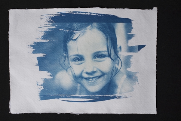
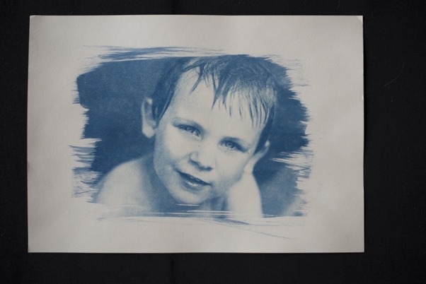
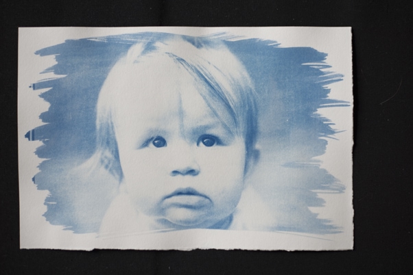
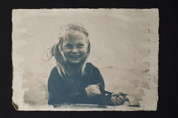
The next issue I had with the cyanotypes was the colour. In some images the blue is really nice and works well.
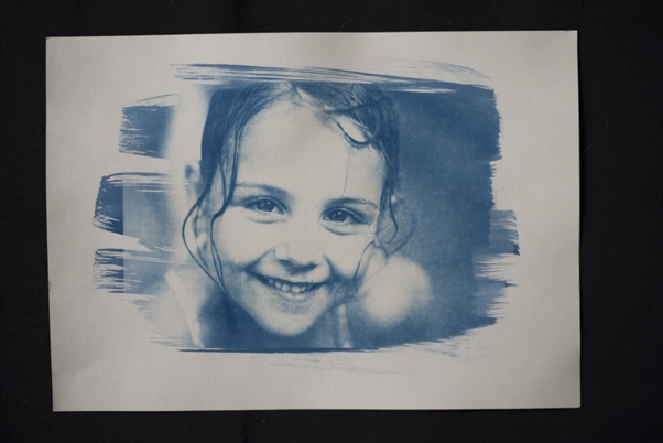
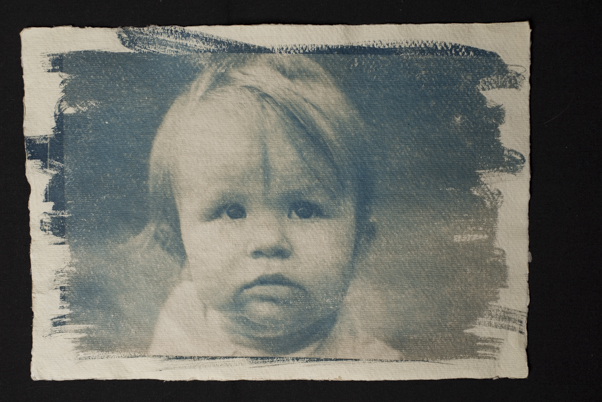
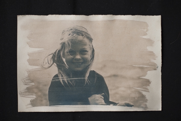
But sometimes it is nice to give the images a vintage feel by toning them sepia-ish.
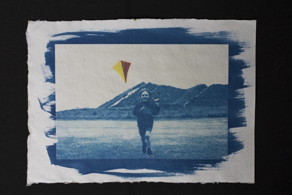
And finally I combined the cyanotype process with digital inkjet printing by selective printing part of the image in colour and then adding the cyanotype process afterwards.
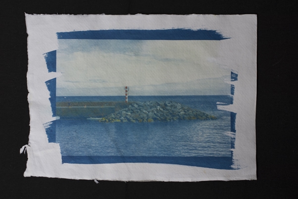
I will now look more into sky and seascapes with the addition of some colour. That might look interesting and looks a bit like hand colouring.
I’ll also look more into improving my technique for portraits. I think particularly children’s portrait do look nice as cyanotype. Here I still have to work on my brush stroke. I have used a foam brush in this batch and this is much better than a normal one as it is easier to apply the chemicals evenly and it still gives nice ‘arty’ borders.
What do you think works best for kids’ portraits? The rougher or smoother paper? Toned or in blue? Let me know!
♥️